Studies suggest that one of the easiest and most comprehensible forms of presenting statistical data is through graphs and charts. However, when it comes to using these forms of visual representations, many students do not know the popular types of charts in statistics and their precise usage. There are various forms of statistical graphs and charts like line graphs, pie charts, pictographs, histograms, etc. But, not all of them can be employed to highlight similar types of data. If you do not know the common graphs and charts used for presenting statistical data, read this blog. Here we have discussed various charts and graphs for the representation of statistical data and what type of data can be presented through them.
14 Types of Charts in Statistics
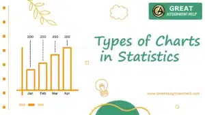
Here are the 14 types of charts in Statistics.
1. Line Graphs
A line graph displays the constant change of data over a while through a graph. Between the x-axis and the y-axis of every line graph, there are points. It links data to highlight continuous change. Most often, time is spread across the horizontal axis.
Uses of line graphs:
Line graphs are used in the following situations:
- To display trends. For example, the increase of prices of houses over a range of time.
- Predict things based on data collected over time, for example, forecasting climate changes.
- Evaluating multiple variables, situations, and information over some time.
Also Read: Best Statistics Project Ideas to Get Started
2. Bar Charts
Bar charts are one of the most popular types of charts used in the following areas:
- Economics
- Statistics
- Marketing
They compare several categories of data through rectangular bars. Here, data is represented through two axes, perpendicular to each other. One of them presents the categories while the other represents the values in the form of bars. Each bar on the axis indicates the height corresponding to the representative values.
Uses of Bar Charts:
Bar charts are typically used in the following cases:
- To showcase data arranged in nominal or ordinal forms.
- To evaluate dataof various categories.
- Highlight significant changes in data over some time.
- Presenting data distribution over 4 or more categories.
3. Pie Charts
A pie chart is the other important type of chart in statistics. It showcases data and statistics in an easily comprehendible ‘pie-slice’ method and demonstrates statistical proportion. Every slice of the pie is proportional to the specific group as a whole. In other words, the pie chart divides a category into many subcategories. It highlights the relationship of every part of the entire pie. One can prepare a pie chart if a list of categories and numeric variables are available.
Uses of the Pie chart:
A pie chart is used for multiple purposes as specified below.
- To create and present the composition of an element
- Showcase nominal and original data categories
- Highlight the proportion of data
- Compare a subject’s various sections of growth
- Showcase 3 to 7 types of data
- Demonstrate marketing data, especially in data-driven markets
4. Histogram
A histogram is very similar to that of a bar chart. However, here, the bars or columns are attached. Moreover, histograms represent continuous data or the frequency of data in a set, but bar graphs display categorical data. It displays the frequency of data in the set.
Uses of the histogram:
Following are the uses of histogram:
- When there is a continuous flow of data
- You want to display the figures of a data distribution vividly
- Analyze the difference in the methods of obtaining outputs
- To make a graphical presentation of a large sum of data
- To share data distribution with others
5. Scatter plot
A scatter plot presents data at various points of the x and y-axis. It shows the connection of two variables called independent and dependent. Here, viewers can analyze how one variable has an impact on the other. Scattered plots also help to calculate the independent variable and use it to forecast the behavior of the dependent variable.
Uses of Scatter plot:
Typically scattered plots are used in the following situations:
- Determine if there is a connection between two variables
- Predict the performance of the dependent variable
- To pair numerical data
- Analyze the depth of a specific problem
- Observe the correlation between 2 gigantic data sets without considering the time
Read more: Top Uses of Statistics in Everyday Life
6. Venn Diagram
Subjects like math, statistics, and computer applications use Venn diagrams to present scientific and engineering data. Here circles overlap. It helps to find the areas that have specific common features. Typically components placed on the outer portion of the circle do not share common traits.
Uses of Venn Chart:
Venn diagrams helps to meet the following objectives:
- To compare and contrast a variety of things
- To segregate items by groups
- Showcase the rational connection between different sets of data
- Determine the probable relationship between various datasets.
7. Area Charts
It is another significant type of chart in statistics. Area charts highlight the change in quantities of one or more elements over some time. Area charts and line charts are very similar. They just have one visible difference. In the case of area charts the space between the axis and the line is colored, but line charts do not use any colors. However, line charts can never substitute area charts since they both have different functions. Line charts present various data sets. In contrast, area charts present data of single data set since colors fill up the area where lines are drawn.
Uses of Area Chart:
The following are the uses of area charts:
- Area charts showcase the continuous progress of a specific subject instead of showcasing its values.
- Draw a comparison of the data set trends of a period
- Highlight the levelof a change
- To compare a small category of items
8. Spline Chart
The Spline Chart is one of the most popular types of charts in statistics. A spline chart is also similar to that of a line chart. However, there is a difference. Spline charts have curved lines that meet the data points while line charts include straight lines.
Spline Chart Uses:
A spline chart is used in the following cases:
- When data to be plotted needs curve-fitting.
- For developing Pareto charts.
- Model data and assess intervening values when several data points are limited.
9. Box and Whisker Chart
Box and whiskers are other types of charts used in statistics. It uses a quartile to showcase a set of numerical data and presents it in the form of a frequency distribution. You can display the extent of skewness of a data set with the help of a 5-number summary method: It includes:
- Minimum
- Maximum
- Median
- Lower quartiles
- Upper quartiles
It offers a statistical summary for specific number sets. You can learn about the following from the Box and Whisker chart:
- Range of numbers – maximum to minimum
- Spread of numbers – Upper quartiles to lower quartiles
- Center of the set of numbers – median
Box and Whisker Chart Uses:
Students and professional use the box and whiskers chart in the following cases:
- To monitor the upper and lower quartile, mean, median, and deviations of large data sets
- To take a glance at the distribution of data sets
- When there are various sets of data that arise from standalone sources but are connected in some way
- For comparing different types of data
10. Bubble Chart
Bubble charts are the type of graphs that are very useful for comparing the connection of data in 3 numeric-data aspects:
- the Y-axis data
- the X-axis data
- data that show the size of the bubble
Both axes showcase numeric values.
Moreover, Bubble charts and Scatter plots are very similar. The only difference between them is in their functionality. The 3-dimensional aspect of the bubble chart offers a more valuable presentation.
Bubble Chart Uses:
Bubble Charts are used for the following purposes:
- Showcase at least 3 aspects of data
- Compare and showcase the connectionbetween grouped circles, with the help of proportions.
Also read: Understand The Prominent Differences Between Statistics Vs. Parameters
11. Pictographs
The pictograph or a pictogram is one of the most captivating types of graphs and charts. It showcases numerical data through various icons or picture symbols to symbolize data sets which simplifies data visualization. Typically, a pictogram highlights the data frequency through a specific image or symbol.
Uses of Pictograph:
Pictograms helps to meet the following purposes:
- To promote fun learning
- Use images and icons to make your viewers recognize information easily
- To create infographic content.
- To compare 2 points very sensitively
12. Dot Plot
A dot plot or dot graph is one of the many types of charts in statistics that arranges statistical data neatly. Here, dots represent small data sets. They also help in organizing statistical data. It uses dots to represent data of different categories. If a numeral appears more than once, place a dot above the present dot for each additional appearance of the numeral. Therefore, the height of the columns of the dots represents the frequency of the values.
Uses of Dot Plot:
A dot chart helps to meet the following objectives:
- Plot the count of frequency for a small range of categories
- Represent quantitative or categorical variables.
- Display measurable data that has only one variable.
13. Radar Chart
It is one of the most contemporary types of charts in statistics. A radar chart is best for making comparisons of multiple items. It has a circular display that includes different quantitative axes that are similar to the spokes of a wheel. Each axis highlights a quantity for various uncompromising values. In the present time, multiple subjects use radar charts. The most popular among them are statistics, math, business, sports analysis, and data intelligence.
Uses of Radar Chart:
Statisticians and students meet the the following objectives through Radar charts:
- Observe which variables share the same values
- Analyze if there are outliers in every variable
- Present the results of multiple assessments in one place
- Analyze if any variable scores low or high in a set of data.
- Assess the performance of datasets
14. Pyramid Graph
Pyramid Graphs are easy to understand. It is a triangle-shaped chart. Here, place the data as per hierarchy. Levels of data show its progressive order.
Pyramid Graph Uses:
Pyramid data is mainly used for the following purposes:
- Showcase the level of the hierarchy of a topic
- Showcase progressive order of data
- Highlight the connection of data in datasets
The Bottom Line
The discussion above highlights 14 distinct types of charts in statistics and their individual uses. Among these charts, many share similar characteristics. However, never mistake to swap one with another, the results can be fatal. If you still have confusion related to the application or of any form of charts or need help to develop these charts, get in touch with our statistics assignment helpers. They will make sure to develop your statistical charts accurately. Moreover, by utilizing our assignment help service online, you can complete your tasks on time and achieve top grades.